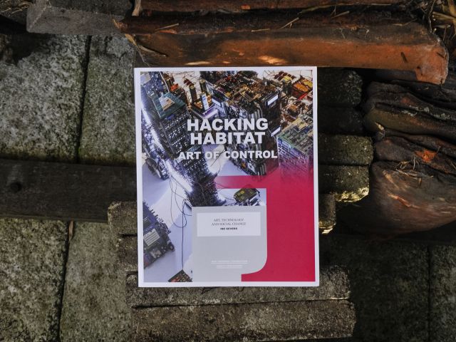
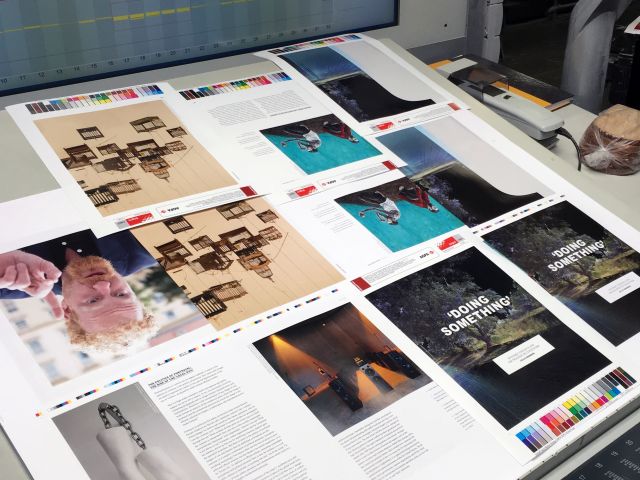
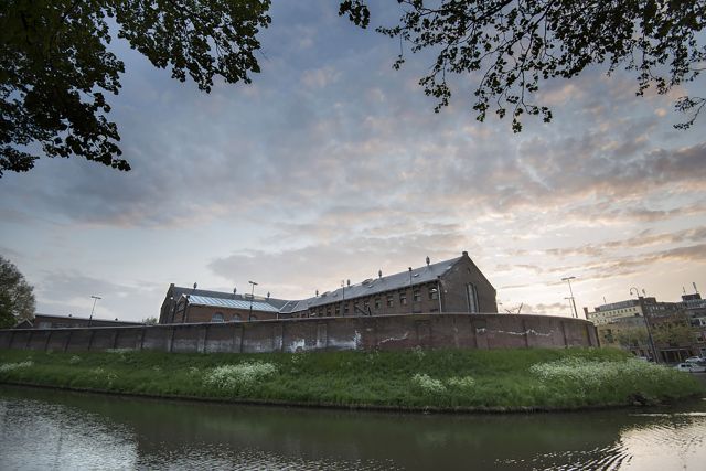
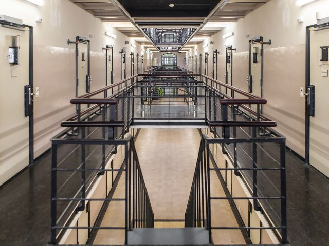
Balancing technology & humanity in a visual identity for this blockbuster art manifestation in a former prison
Typeface hack
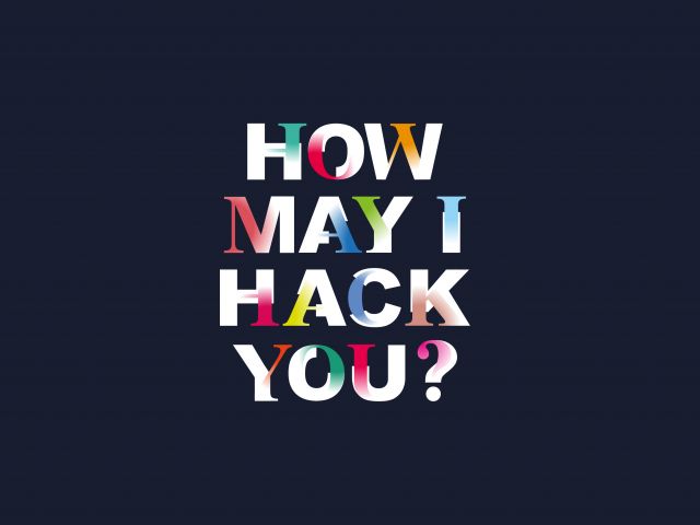
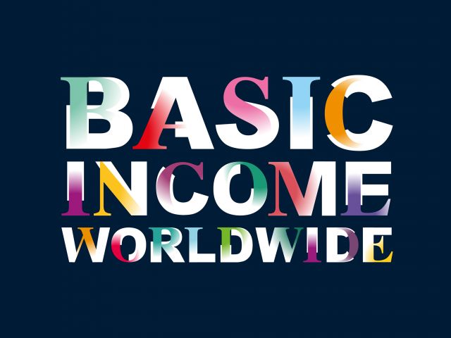
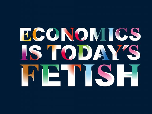
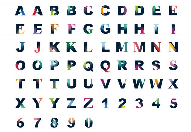
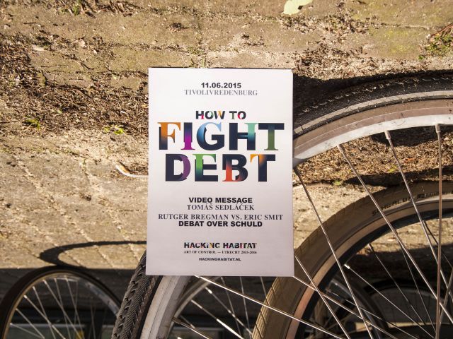
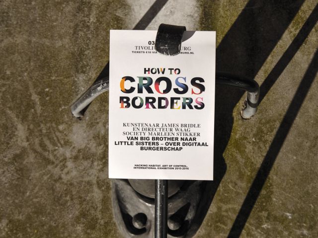
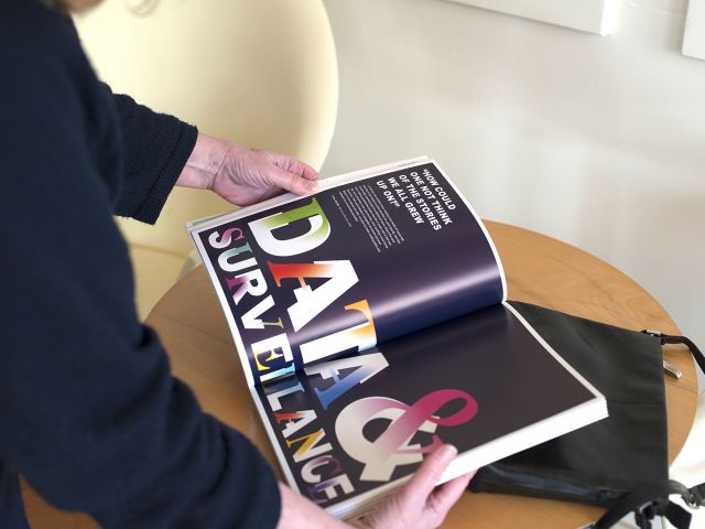
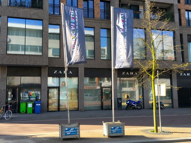
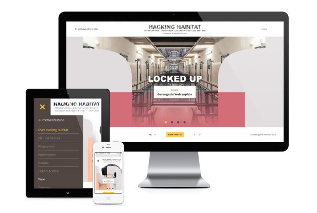
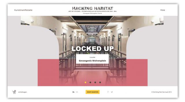
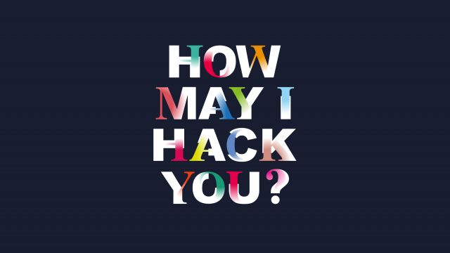
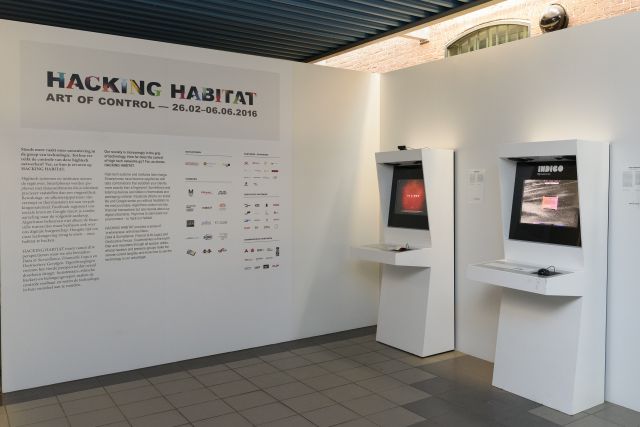
In the creative brief, there was this little detail that caught our eye: the client wanted us to 'work with fonts available on every computer'. So we took two well known, and widely used fonts: Arial Black & Times New Roman Bold. These fonts to itself were not particular appealing to us as designers, so we decided to 'hack' them. The typeface that was created is constructed from two different designs: the Arial Black, which to us is a very basic, stern and constructed typeface. In our concept, it stands for the government. The color that accompanies this government, is dark blue. A color that exudes confidence.
On the other hand, we used the Times New Roman Bold, a typeface less constructed, more curved and with beautifull details. It stands for the individual. We used all sorts of colors to make each letter individual and different from eachother. Just like in the real world. Both letters are irrevocably linked. Both are condemned to each other. Both need to balance eachother out.
