Using the architectural theory of the Plastic Number to create a corporate identity and typeface
The Plastic Number
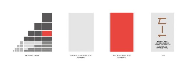
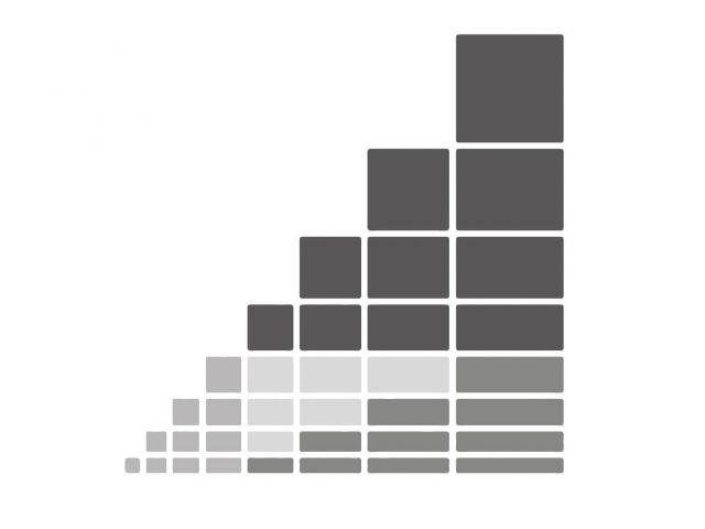
From this idea of origin and relationships, Autobahn designed a visual identity for 1-N. An important concept for the identity is the relationship theory of Benedictine monk Dom Hans van der Laan (1904 - 1991). This theory shows us how objects are related. He called this 'the Plastic Number'. A visualization of this theory is shown within the Morphotheek:
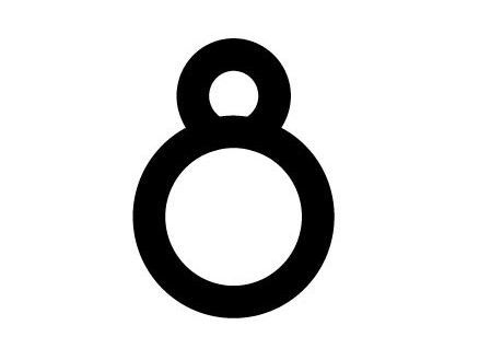
Typeface
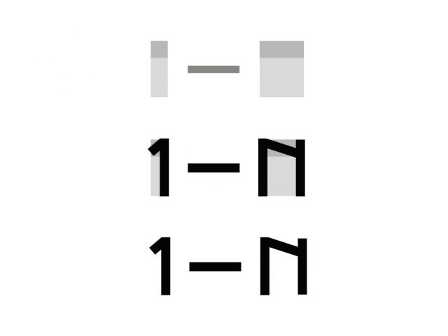
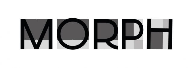
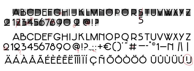
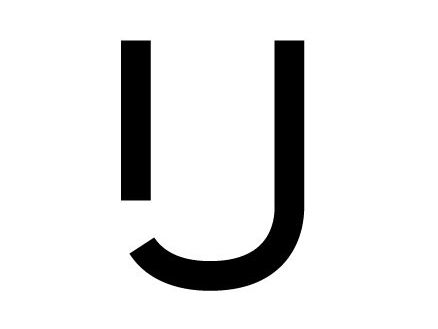
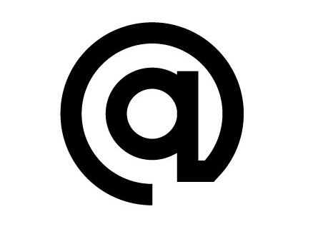
The typeface Jakobus is designed with cubes from the Morphotheek to create a scale relation within and between glyphs. The stroke of the glyphs is based on the smallest width in the Morphotheek. Within the typeface, a logo glyph is added and is accessable through Open Type features. By doing so, 1-N can share the font instead of .eps or .jpg files of the logo.

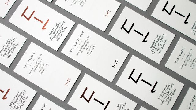
Business card
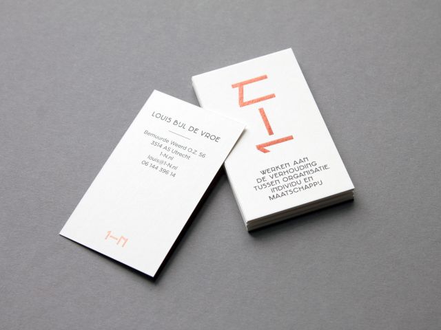
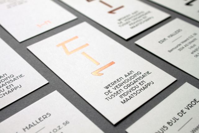
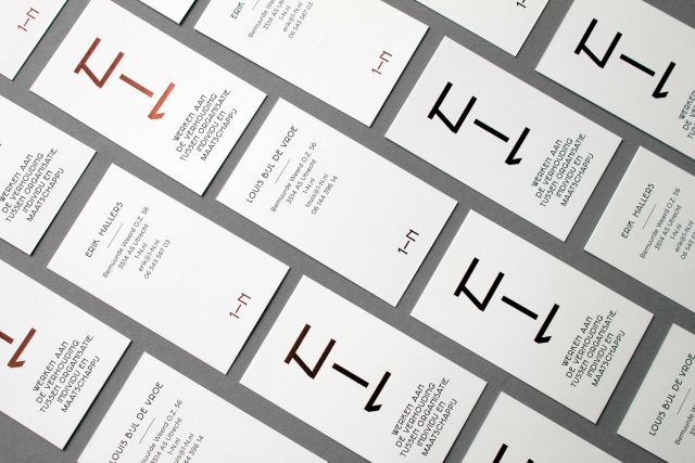
The measurements of 1-N (print)materials is also based on the Morphotheek. The conventional size for a business card is 55x85mm. The 1-N business card is 50x85mm, making it slightly different in look and feel. Printed in black on 350 grams Olin natural white with a copper foil stamp and typeset in Gotham and Jakobus.