Using gentrification and modern nostalgic signing to uplift an abandoned industrial site
Identity
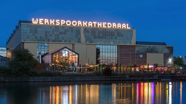
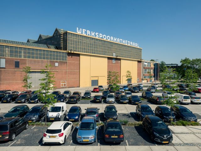
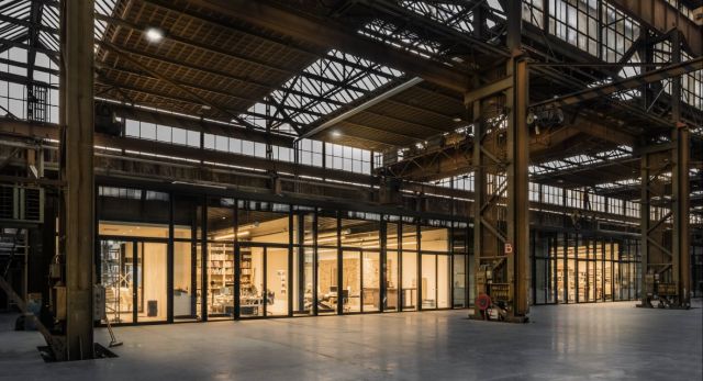
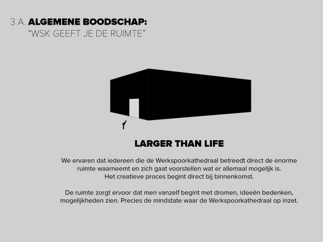
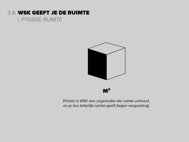
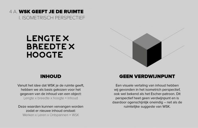
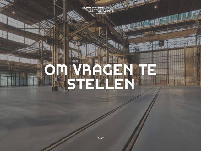
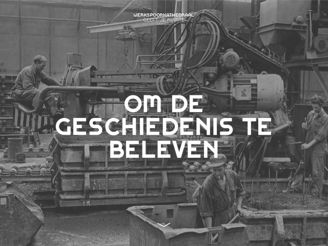
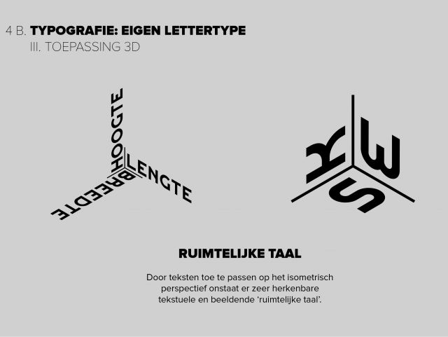
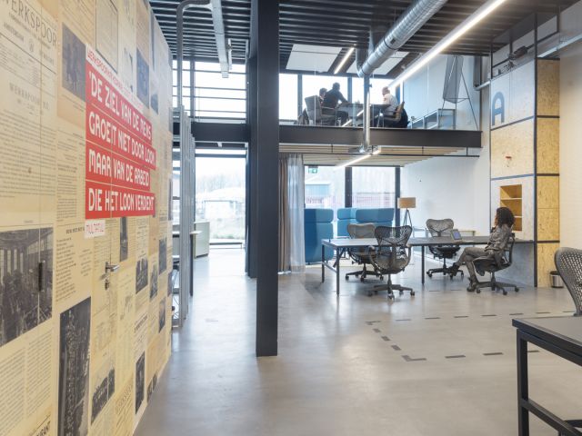
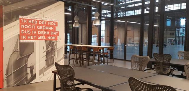
The identity is based on the mantra 'De Werkspoorkathedraal gives you space'. The location is in fact an empty box that can be filled with all kinds of ideas, visions and events. When entering De Werkspoor Cathedral you will be overwhelmed by the enormous capacity. Using the isometric perspective in the identity, we simulate that this property has no vanishing point and thus endless possibilities.
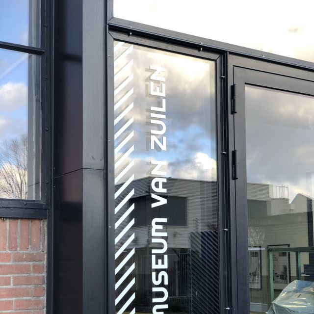
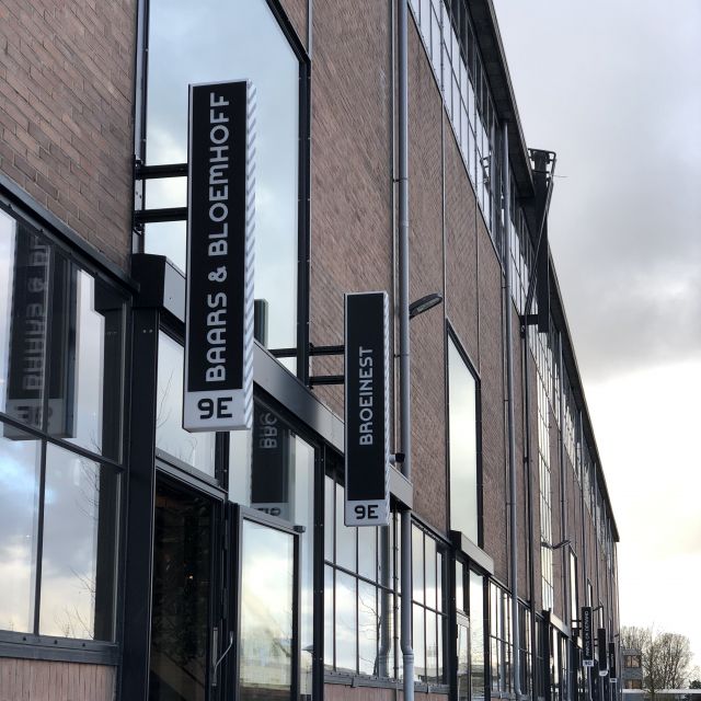
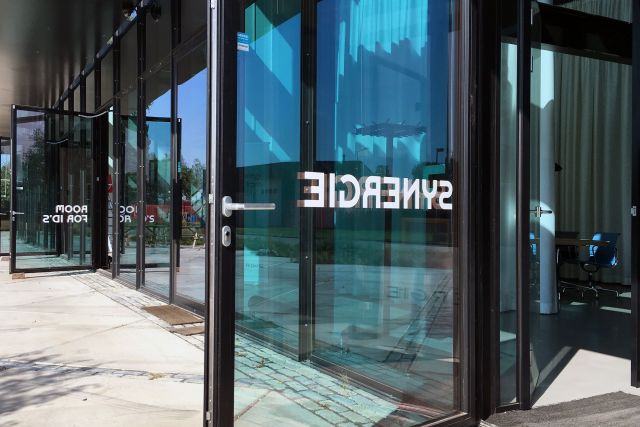
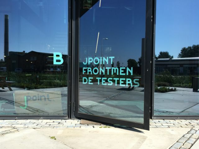
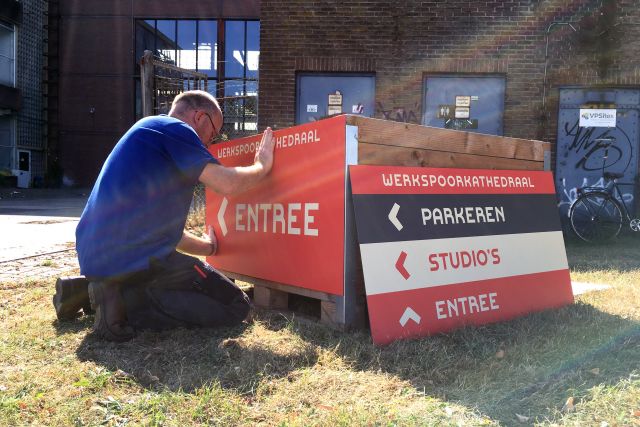
Signing
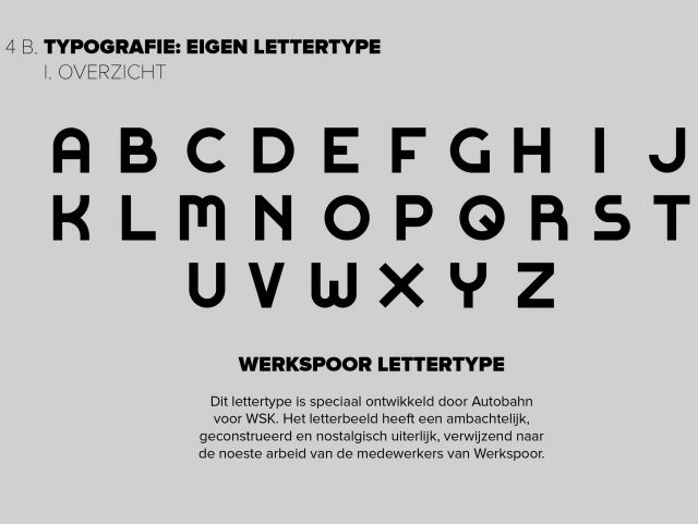
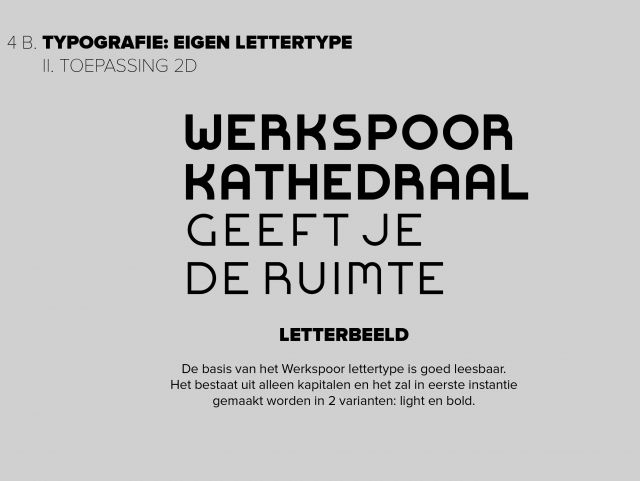
When designing for such a large volume, signs should be legible from a large distance. That's why we designed a rudimentary and straight forward bespoke typeface with nostalgic hints. The typeface comes in two weights: normal and heavy.
WSK Flex
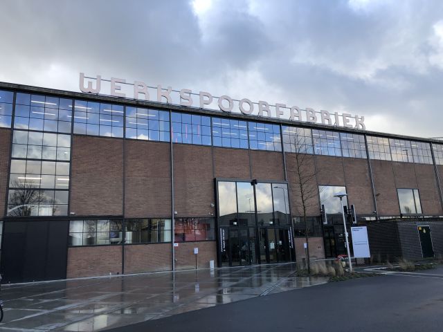
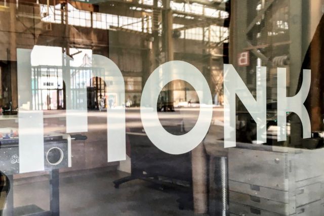
Werkspoorfabriek
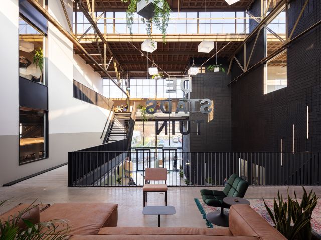
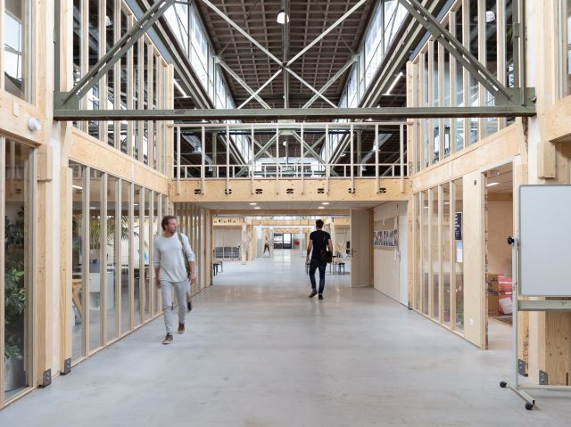
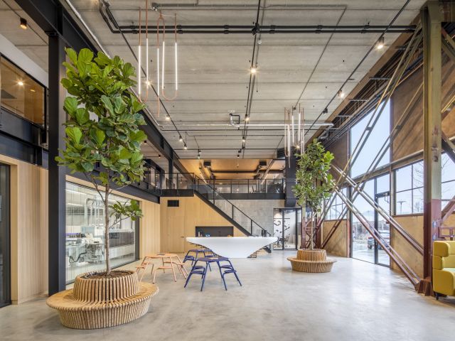
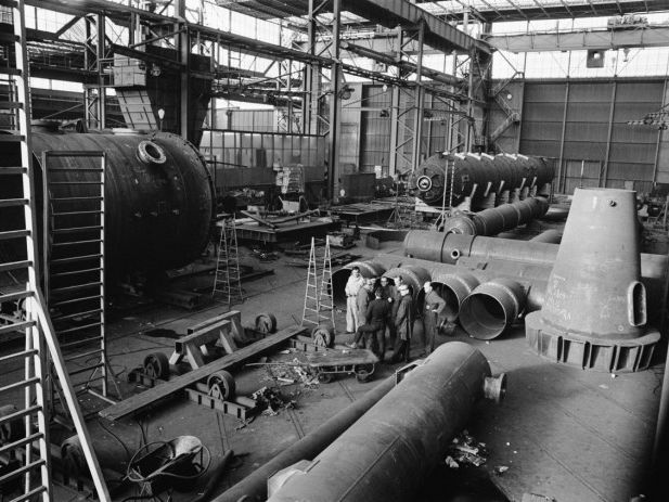
Autobahn has created a strategic vision for future development in the area, providing a scenario based approach and naming of a property. With this approach, a sustainable and diverse user group will be attracted and serviced. Recently an adjacent location is added to the Werkspoor family: De Werkspoorfabriek. Where De Werkspoorkathedraal is focussed on events, this property offers workspaces for artists, designers and creators like a brewery and a 3D printing hub. Build by ZECC architects and Sustainer Homes.